P3: First Unfinished Draft

This is my first unfinished draft that is a work in progress for Project 3: The Cyclical Nature of Things. While creating this I combined several of my pictures with the intent of things I love to see in nature and the creative idea of a surreal abyss or other worldly image. As of now I am unsure if I want to continue with the saturated color scheme I have going on or if I want to use more realistic colors. The theme of my project for these series of iterations is, "Things in nature that I love." along with creating images that represent the a cycle, change, and variety. One word or phrase I would use to describe is "picture perfect", these images I will be using are pictures that I consider to be perfect in my eyes.

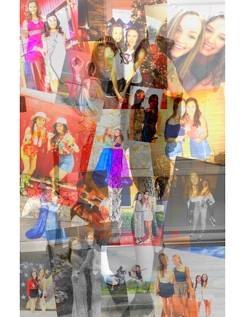
To help you with your color decision, I think since you are aiming for a surreal abyss having those very saturated bright colors we don't always see in nature is important to it. However, I do believe you should also mix in more natural colors. These can create really cool effects while using blending modes. To reference my own work my last piece for the Destroy the Icon (one with the question mark) it has a mixture of natural and also very vivid colors. The combination of them both made me very satisfied with that iteration it self. Hopefully, this helps.
ReplyDeleteI love the colors that you are using. But I am a little confused by them. we don't really see these colors naturally in nature so maybe of you would use the original picture and add a blending layer it could give you some other color choices.
ReplyDeleteThis is really cool so far! I think making the scene look real and also surreal will be your challenge here - I'd make the sign more opaque so you don't see the background through it. Or if you want it to be see-through, maybe make other things see through as well. Just think about the natural laws of your other-world and stick to them throughout the image!
ReplyDeleteThese look like inverted filters you've applied? Very nice the way it worked on the sky in the background! I suggest trying different blending modes to make the separate items pop a bit more so the colors don't appear to be repetitive.
ReplyDeleteThe colors are super super vibrant and create a kind of "dream world" which I think is an interesting comparison to your word of "picture perfect". With really bright neons, sometimes using blending modes can create a pixel effect, which could be interesting if you wanted to take a more digital approach/feeling
ReplyDeleteI think messing with the colors a bit and creating a real focal point could be nice to experiment with, since right now everything is the same color and fights for that focal point. Cool concept!
ReplyDeleteI love the composition so far, however I do agree that changing some of the colors in order to define a focal point could be beneficial to you. Maybe you could mute the butterfly or sign just a little bit to do that.
ReplyDelete